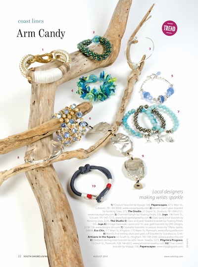
Product Photography is always interesting. What to leave in, what to leave out. This is a jewelry photo I did recently for South Shore Living Magazine. The jewelry was beautiful. And we didn’t what distract from that. But just sitting on a white background would be boring. Add the the driftwood and you have texture and depth. Always keeping in mind that text has to be dropped in. You want show off the product, not the props.


Recent Comments